Hello Painters,
during
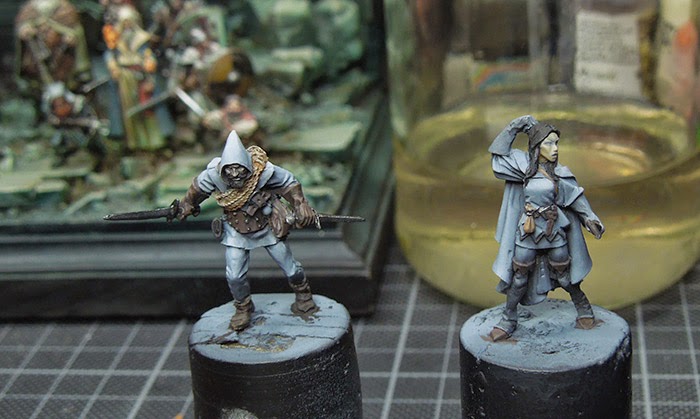
MV's last Tutorial Voting 82 people voted and three of them voted for poor "Dragon Priest", the rest went for "black".
The decision in here was pretty evident, so let's paint it black! Thanks to everybody for taking part in the voting, even the direction the result of the vote will go was clear pretty fast. This shows us that you are enjoying
Massive Voodoo's year of the painter and makes it clear to us that we are on the right path to make your jungle grow the way it will be in the future.
_______________________________________________________________________________
You want to support Massive Voodoo?
If you like to support or say thanks the monkeys of Massive Voodoo in what they do, please feel invited to drop a
jungle donation in their direction via paypal or check their miniatures they got on sale
here.
__________________________________________________________________________
Introduction
Well, everybody struggles in painting specific colours one day or the other. Black is one of such colours. First, let me tell you something that could make you go sad: You won't find a colour recipe for painting black in this article. Instead this article tries to explain to you what you have to take care of while painting a specific colour. This article is trying to give you the knowledge on how to build a ship on your own instead of telling you how to chop wood for a ship that might be build. This being said let me tell you, if you read this article properly and give it a try you will learn forever to paint your blacks interesting. Really. If you do not read properly and give it some proper thoughts and time to sink in your blacks will stay just blacks.
Why is there no perfect colour recipe for painting black?
Well, easy answer. Black is not just black. Never. Black is something really strange and interesting to be observed and painted. You need your eyes to understand what is happening with colour, so let's have a look together on some photos of daily life
"supposed-to-be-blacks":
While I went to my last painting class in Vienna, Austria during the last weekend I took with me a black backbag, a black suitcase for all that painting class material and a black jersey. A photo of all the three of them was taken at the departure platform while I was waiting for my already delayed train. Don't look on the cat hair on the sweater, just look on the
"supposed-to-be-blacks".
Why aren't all those pieces pure black, even they are supposed to be black?
Easy answer again. Black is not just black. Black, like every other colour is influanced by the light situation that sorrounds it, light that hits it, light that makes shadows to a material. It is also influanced by the material it is made of. Material that reflects or absorbs the light. Shiny or matte material. Different Material does this varying from strong reflections to some kind of mostly none existing.
I do recommend the following two article to you if you are interested in painting light:
A well illustrated guide by Raffa showing you theory about light and shadow.
A guide that shows you how you can bring your miniature into a good light situation.
In the photo above the jersey has the weakest light reflections going on, because fabric mostly absorbs light. This depends of the fabric for sure, if you take silk it is a total different story.
Let's have a look at the
suitcase's plastic. It reflects the light pretty strong. A lot of edge highlights going on here, all that shiny reflections on the material that is supposed to be black. Even yellowish reflections come into play here (remember the light and its colour that influances the surface - this was during daytime with a strong sun).
Same light situation now, different material,
the backbag. Still not pure black, something greyish going on here but no such hard edge highlights as on the suitcase. Look at the metal zippers, how they are different from the light situation. Metal reflects light completly differently again, much stronger, even stronger than plastic.
Now again, lets have a look at the gap between the suitcase and the backbag. There is a red bag stuffed in between and why does it make the black look red?? Well, easy answer. Black is never pure black. Light hits the strong reflecting material of the plastic bag and reflects very strong from it - it is creating a so called
"bounce light" that jumps to areas nearby. Depending on the material of areas nearby it is getting more influanced or less. You even can find yellow here too - any idea where this
bounce light might come from?
Now how is that with all the different materials that occour in the world? How can one maintain so much information and collect it for miniature painting?
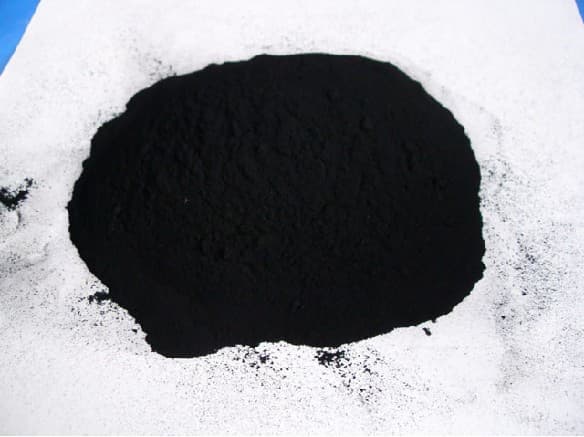
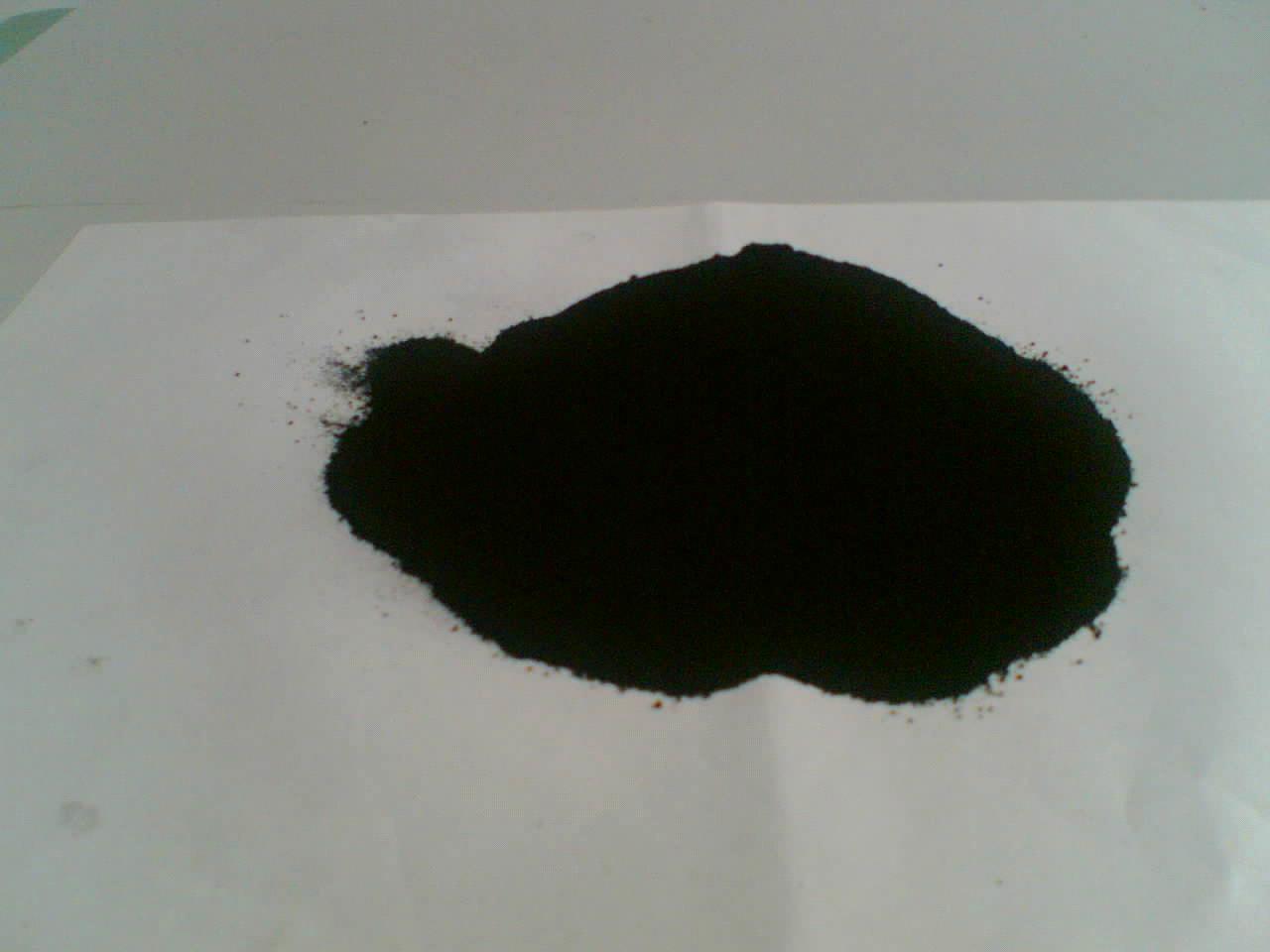
Well, easy answer again: Observe and look when you are on the way through your world. The more a material is shiny, the more it reflects the sorroundings. The more matte it is the more light it absorbs. For example a very shiny blink blink black polished car can look like
this. On the other hand carbon is very very very matt and absorbs most of the light. It is truely dark, click
here to see or
here. If you take your eyes, brain and time you will see a thousand explanations just right in front of your door. Take that chance, don't waste it.
Ok, so far with the introduction. I hope your brain did not explode already. Let's sum up important terms we found while talking about black:
- Material attributes
- Light Situation
- Light and Shadow and its specific colours
- Bounce light
These points actually influances the shown "supposed-to-be-blacks".
Wait a second: Do they only influance blacks? No, definatly not, every other colour and everything your eyes can see'n'observe is influanced by this
, BUT different colours react different to light influance too.
Adding this information to your brains now might make them go explode, so we will stay with black now
as the article is about painting black.
Forget about other colours for the moment!
__________________________________________________________________________
Painting black that does not look like grey
Still there won't be a perfect colour recipe for you painters outthere. I told you there is none and it feels wrong to me to tell you there is one, I still prefer showing you how to build a ship on your own instead of explaining you how to chop wood or how to knot rope.
Beside the above named important terms there is also other information you have to keep in mind while painting your project and your blacks. Something that makes your miniature project a harmonic overall piece:
The athomosphere of the scene. That means the light situation of the whole piece. Which colour does your light or shadow have? Which material gets influanced by those colours in your light and how does the material show reaction to it?
In the next examples I show you different blacks in different athmospheres and will explain the contrast range you can paint on your figures blacks. A
contrast range is the way you paint a colour, from dark to bright to produce a light and shadow effect to an area. This colour change is also called "blending", a transition from one colour hue to another the hue between the darkness and brightness of a colour. If it is very clean, it is a smooth blending, if it is rough it is a rough blending.
Example #01
- shows you how most paint their blacks, using black to grey to white.
Well, if you paint such a transition on your miniature surfaces it will never look black. It will look like grey. Like this example:
Why is that?
Easy answer, again. The amount of grey in your contrast range is too much.
Example #02
If you want to paint something black a lot of the area has to stay in
black and only final lights will become grey, final edge highlights
maybe reaching out to white. Let's check the contrast range:
And the example:
Example #03
Yet there is no influance of light colour in that game. It is just pure black and often when you paint such to your models it looks like a dark stone or just black build up from grey. It can look good but it never looks realistic or interesting. So lets put some colour into our contrast range of black. You need to gentle with it or it will quickly turn into a dark colour and will not look like black in the end. The following contrast range will be noticed as a "brownish black".
You can use it if a warm yellowish/brownish light influances your overall athomsphere, like during daytime with a strong sun.
Example:
Example #04
Now after we checked with warm colours let's check with a cold blue in the next example. What are you talking about Roman? Cold and Warm? Here you go:
A basic approach on cold and warm colours.
Example:
Example #05 #06
Now I feel that we can play that game. Let's check for other black contrast ranges:
Example #07
Now to the next example that shows you how you can influance your athmospheric blacks by the amount of saturation to your colour choice that you add to the contrast range. Have look again to the upper purple/reddish black above. Let's have a look on this one with less saturation now:
See how you can change the appereance of the shadow intensity and the light colour by using less or more saturated colours.
Example #08
This example now brings you total combination. We have a little colour hue in the black like in example #07 but this time with some cold shadow (dark blue) influancing your black in its shadows. Look close, compare it with the #07. It is there, it's gentle but it gets even more alive. So not only colour black in your lights work also in the shadows.
__________________________________________________________________________
Painting black to miniatures
Guess it is time for another sum up after those eight examples.
If we now take in focus what influances a black that we paint we can easily say it is the overall athmosphere of the scene. In it we find the light and shadow colour that influances surfaces, reflects on them and depending on the material properties might even create a bounce light to sorrounding areas. So you need to think of that if you don't want to paint straight black that might look like grey.
Before this article is the reason for splattered brains among the painters tables, let's take a big step back to our small scaled miniatures:
We are painting small miniatures so it is always good to know and be aware of that
scale. You can not paint everything you can observe in real life to a
small miniature. You can try, but your space will always be limited and
that brings us to the point where we have simplify matters.
First you have to choose which material you want to paint, matt or shiny one, reflecting or non-light-reflecting one. What already might help if you choose the right black that you are painting with. There are many different black colours outthere and some are more matt, some are more glossy. This guide by Raffa could already help you by this choice:
Raffa takes a close look on a lot of different blacks.
Next I will jump to some miniatures that I have painted in the past years, using blacks and not so blacks. If you did read so far and really thought about the explanations in here the following examples should be easy to recognize and graspable for you. The models are a wide selection from the figures I have painted the last years, from gaming pieces to bigger display projects. Please excuse the quality of the example photos as some of them are really pretty old by now.
By the way if you consider saying thanks for the effort and time that went into the
development of this article please feel invited to do so via a
Jungle donation.
Miniature Example #01
Let's start it simple, a gaming model I painted a little while ago. Using a contrast range mainly from black, grey to white. Today I would even say there is still too much grey along the contrast range to really make it go shiny and reflecting black. No bounce light from the white snow either, which usually is different with snow as it reflects light very strong.
Miniature Example #02
Again in this older example I used mainly a contrast range from black, grey to white. In the armour and the belt, kind of the same colour ranges there, no true differencein the material and no bounce light or bigger light situation going on here. You can find a complete step by step of this Space Marine brother
here.
Miniature Example #03
In this example I found variations of blacks while I painted this black templar. Today I would say he still looks like a grey templar as the amount of grey is still to much along the contrast range, but colour variations in the way I painted the armour appeared.
Miniature Example #04
In this example I went more into the reflections on the material than I did before. Still the black looks more greyish due the amount of the grey in the contrast range. Additional work with glazes of black would help with reducing the amount of grey. Additional glazes with coloured black would even bring in some bounce light from the greenish ground.
There is little cold colour in the tone of this Marine. A cold black if you want to name it, but not much and I went way too quick into the grey, so it is hard to recognize it. If something like that happens to you and you want to keep the colour of your black even in the highlights throw in some colour again at the spot where it is getting to grey because of the amount of white.
Miniature Example #05
In the following example I did not went into the reflections on the black but tried myself on some direct bounce light from the ground and the object source light of the weapon.
Miniature Example #06
In
the following example I totally failed during my paintwork on "the Nightwatch" while I planned to make those two scouts pretty dark/black I took way too much cold grey in the contrast range. So this is not an example on how to paint it black. I already realized during the Work in Progress that they will become way too bright, but everything happens for a reason, eh?
Miniature Example #07
The small 1:72 Shinobi recieved some cold colour again in his black colour range.
Miniature Example #08
Peter provided me with an example of the cold black he did paint while working (WIP) on his latest minotaur.
Miniature Example #09
On the latest painted bust of Sha'un - Ram Tribe Warrior I also went for a cold black fur:
 Miniature Example #10
Well, enough different examples. Let's have a closer look on two models due little more step by step thoughts while painting. The first one is the cybot I did paint during
"the Last Light". I started with priming the whole scene black. The next photo is not that important but I think as we are talking about black it is already interesting on how the sorrounding light reflects on just the primework:
Next step was finding my basic colour for everything. We are taking a closer look on the Cybot now. I started to paint him black but with a cold touch.
Now it was time to increase the contrast to bright areas. I tried to concentrate on small areas here as I did not want to paint him grey again. I planned to make him a bit more shiny beside the masses of Tyranids around, so this was just the start of the highlighting work.
While I increased the contrast range of the black even brighter I realized that I am losing my black main surface look. I used thin glazes of black to bring that back, but still kept my hihglights powerful.
In the following step I repeated the first ones several times. Increasing contrast in both directions by painting stronger and smaller, stronger and smaller, stronger and even smaller highlights on top of eachother and meanwhile keeping the blacks black by the use of glazes.
In the end a cold black again. Why are most of my blacks painted cold? Well, not such an easy answer as I do not know, but I try to explain. If you gave the
cold/warm-colour article a proper read you might have seen that cold colours will be subconsciously put further away for your eyes. In my oppinion this makes the black even darker, subconsciously. Another cool colour for this effect is a more blueish purple. If the purple gets too warm you will be quickly find yoursefl painting a warm black.
Miniature Example #11
The second more step by step example is a Ravenwing biker I did paint for gaming purposes. I often find myself using cold colours in my black contrast range, so this time I went for a mix on purpose. Warm and cold this time.
Well, first thing to do: I chose a cold and warm colour to be mixed into my black.
By mixing it in you can already see how the temperature of the colour changes. Additional to that also the black becomes a dark grey, but a cold or a warm one. I will work with that.
The Biker was primed with the airbrush.
Using the warm-dark-black-grey-something on his right side using thecold-dark-black-grey on his left side. The difference is pretty obvious I'd say:
Now it comes to highlighting these colours on each of the both sides. I already know where the journey should lead: to very strong reflecting edge highlights and brighter areas here and there. So for the cold-dark-black-grey I did choose to highlight with a cold colour still: A bright grey with blue in it. For the warm-dark-black-grey I did choose a more neutral grey.
Put it in the mix. See the warm/cold difference.
I wanted that result to appear fast and used the airbrush again. Maybe I should have taken the brush as all went pretty bright and grey again, Who would have guessed, eh? Still see the colour difference on both sides?
I wanted more still. I don't worry if it looks not like black anymore. It helps me to see the vision I have of the finished piece, I can make it darker later on, no matter what.So I decided a for even stronger and more saturated cold colour on the cold side.
Again used the airbrush to bring it in from right angle. I made some areas stronger to be more reflecting on purpose. Only done on the cold side.
As I said, it all now is too bright and look more like grey, so I did what I also did on the cybot. Using glazes to darken it down again. I did not want to take the long road that I went for the cybot with all that
wax on and wax off, so I decided to take the quicker way by using Army Painters Strong tone and added some black to it. I know that Army Painter has the dark Tone too, which is a black wash but it did not yet belong to my collection during this project.
I did several glazes of this wash until I had all the areas dark I wanted to be black again. Several as said, let them dry and then put the next one. I do like to use the Army Painter washes for such as they dry out pretty matt. If you think about zenithal light while doing so, you can provide the figure with interesting reflections on the material.
For the final steps I used my grey tones from my wetpalette again to work on some edge highlights and surface contrasts again.
But where did all the cold and warm go?
Well, easy answer, they are there but only recognizable very subconsciously, mainly they happen in the brighter areas. This was a test for this specific article and a quicker figure, but I do not want to find an excuse. If I would like to have them stronger in my game of colours I should have used not such a pure dark/black glaze to bring it down, rather I should have used also some cold and warm blacks via the washing. In the end you know better, but I really want you to take a closer look on the cold and warm areas in the bikers highlights. I know you can see them, there are also reflections from the ground on the lower areas of the bike. Bounce light, eh?
__________________________________________________________________________
Conclusion
Well a lot of talk about just one colour, eh?
If you took your time to read the article properly and maybe read some areas twice you might recognize that there is a bigger picture behind it. A bigger picture that connects colours to its sorroundings if you want to paint it realistic. All of that information can be found in the real world and we as miniature painters can try to bring it to our canvas. I for my own will definatly give these thoughts of mine more experiments and more thoughts in the future as learning never stops.
While I wrote this article for you I already recognized where I want to try something different in the future. My main aspect here will be to concentrate on really working with contrast ranges that have less grey in it to paint stronger reflecting blacks.
I hope you enjoyed the article and the information provided in it. Let me know what you think. Do you find these these thoughts useful for your own painting? Will you give it a try? Will you keep your eyes open when you get up from sleep to study the real world?
If you consider saying thanks for the effort and time that went into the
development of this article please feel invited to do so via a
Jungle donation.
Keep on happy painting!
Best Wishes
Roman
__________________________________________________________________________
Well, Roman wrote a big article here, eh?
Be ready for future articles in your jungle via
Massive Voodoo's year of the painter.
Tutorial Voting Thursday is not far, so stay tuned.
Your MV-Team
_______________________________________________________________________________
You want to support Massive Voodoo?
If you like to support or say thanks the monkeys of Massive Voodoo in what they do, please feel invited to drop a
jungle donation in their direction via paypal or check their miniatures they got on sale
here.
_______________________________________________________________________________


