
Welcome everyone to the second Theory Thursday!
If you are not interested in understanding how the world works, especially light and shadow, color and harmony, you should better skip reading this post and future Theory Thursday editions.
Opposed to the very direct and practical tutorials you will usually find here, these series of posts will go in depth to answer questions that many painters didn't even ask themselfes.
Be reminded that these posts are written by Raffa alone and reflect his understanding of the topics.
He is not always right and if you found an error or you want to discuss, use the comment section!
This week the topic will be:
The Complementary Color Conspiracy
Ok, now this sounds a bit over the top, doesn't it?
First, let us talk about complementary colors.
Complementary colors do exactly what the name says, the complement each other.
They are opposed on the color wheel and mixed, they complement each other to a neutral grey (in theory)

Looking for complementary colors is easy, just take a color wheel and find two opposing colors!
Sounds simple, but there are many, many different color wheels and color systems.
In the first Theory Thursday we already talked about the topic of subtractive and additive color mixing.
And maybe you do know these complementary colors:

And many would agree that red & green, blue & orange and yellow & violet.
These different pairs of complementary colors are born from different color wheels and perceptions.
Ok, we could already finish this edition of Theory Thursday here and agree:
There are many different ways of seeing complementary colors.....
Ha! That would be easy!
But as I wrote in the introduction, this is my way of understanding colors so I will try to share my point of view on this topic.
Let's go back to last weeks edition and remember the color cones!

It's a proven, researched fact how our eyes and brains work together, so it would be best to approach this problem in a way that relies on facts :)
How do we actually SEE complementary colors? And why are they so strong?
Many people know about the way that color cones work or at least that we got them in our eye.
We have Red, Green and Blue color cones collecting information and transfering them to the brain.
But here we have a problem... the brain does not get the information of the color cones in a direct way. It can't process all the information of all three types of cones so the evolution gave us a pretty smart way of pre-processing the signals of the color cones.
This pre-processor or filter get's information by different combination of cone responses and creates a signal that is then sent to the brain.
To create a full image of what we actually see in our brain, we need three types of information:
RED / GREEN
YELLOW / BLUE
BRIGHT / DARK
these three information can be generated with different filters that combine the color cones information into electric signals that are sent through the nerve fiber to the brain.
It's a bit complicated to explain the whole process..
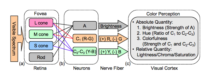
image from Wikipedia by Googolplexbyte
Maybe this image explains it a bit better (even when the most detailed explanation is missing).
Phew.... now it would be a good time to say:
"Raffa, why in the name of sweet baby banana monkey are you telling us all this strange stuff?"
Why are we even thinking about the right complementary colors when our body is using the strongest contrasts to see the world?
Red and Green, Blue and Yellow are the complementary contrasts that are the strongest to see for the eye. Are those the ones you like the most? I don't know!
So, still, after explaining a little bit about complementary contrasts, I can still not tell you which one to use.
I personally love blue and orange.
Tell us about your favourite in the comment section!
_______________________________________________________________________________
You want to support Massive Voodoo?
If you like to support or say thanks the monkeys of Massive Voodoo in what they do, please feel invited to drop a jungle donation in their direction via paypal or check their miniatures they got on sale here.
_______________________________________________________________________________
I've been using a lot of turquoise and purple the past year which has worked well. Especially when I've shaded the turquoise by adding red.
ReplyDeleteThese are a great read and I'm looking forward to more theory info.
Hey Raffa, thanks for the post. It would be cool if you could relate the theory to the actual praxis of paining minis. What does it mean: complimentary colors and shading, for example?
ReplyDeleteVery interesting, thanks :D
ReplyDeleteAh I love your conspiracy theory … the first one which makes sense to me by the way :) Great job Raffa!
ReplyDeleteThis is great information! I would add that one of the reasons the color wheel complementary colors are used in painting is because of how the colors blend when you mix the paint together. A complementary red and green will shift to a brownish neutral when mixed, but true color complements will slide alone the side of the color wheel as in the example of blue yellow they go green.
ReplyDeleteHowever, I believe when selecting color scheme and when mastering colors, you'll have to be aware of all these interactions to get the results and impact that you want.
My compliments on another great article :)
ReplyDeleteSomething I find useful when it comes to complementary colors is to use them to shade each others.
ReplyDeleteIt gives more depth and is richer than shading with black.
For example I shade green with red and red with green.
You can also use this when you basecolor your model. Base color brick red for an orc skin for example.
My two cent
Cheers,
I use comp colours mostly for shading, yellow purple being my favourite. next to trying to use comp colours a lot I also take cold-warm colour choices into considaration.
ReplyDeleteLove this serie of articles, but would love to see some more theory to practical use coverage too.
Keep up the superb work,
Gino
Thanks for the 2nd Theory Thursday. I like it. My favorit is dark Blue and warm yellow
ReplyDelete