31 October 2016

Workshop Roadmap 2017 Information

Dear Ladies and Gentlemen,

it took Roman and Peter quite a time to work things out, but they have finally finished the "Workshop-Roadmap 2017" for the first half year of 2017.

Due to some uncertain event-dates so far they only made plans up to August, so there might be additional classes in the last quarter of 2017. The Roadmap of 2016 is slowly changing into the one for 2017. See everything here!

And here you go:


The official announcements will start soon! If you are already sure that you will join the class, you can send Peter an e-mail and he will place your name on a list.

Important: Please help us to make thing efficient: don´t send us an e-mail if you just want to "save a seat" and decide later if you will join or not. If we place your name on the list, it´s something about respect and responsibility. We want to offer service, but please understand that we will have to react if somebody is abusing our offer.


If you have any questions regarding holding a class in your hometown, please feel free to drop Peter an e-mail: baphomet[at]massivevoodoo[dot]com.

Cheers,
Roman & Peter

PS: 
Some seats are still free for
MV Picster's Sculpting and Conversion Class in Trier, Germany, December 2016
and some seats for
MV's Jar's Beginners Class in Madrid, Spain, November 2016.
Join in now!

28 October 2016

Step by Step: Fire

Hey Jungle Painters!

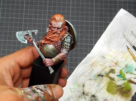
The winner of this weeks tutorial voting arrived. The voices were asking for the Heroes and Villians Dwarf named "Harald" that Roman named "Fire":


 If you want to keep track with an overview on what has happened so far in
MV's year of the painter 2 please check this link!
_______________________________________________________________________________
You want to support Massive Voodoo? 
If you like to support or say thanks the monkeys of Massive Voodoo in what they do, please feel invited to drop a jungle donation in their direction via paypal or check their miniatures they got on sale here.
_______________________________________________________________________________


Roman is taking over the article now - we hope you enjoy!


Step by Step: Fire


Introduction
Allright. A wonderful bust that I painted there, sculpt wise. A true Lucas Pina sculpt with tons of character. I did start my version during teaching a really cool two day MV private coaching with Josua about atmosphere.


My version looked like this when I called it done:


I will try to take you on a journey through this project. My thoughts on how I tackled what I did paint there and some insight into the process. Not a step by step with color recipes, nor technical advices in detail.


Thoughts on Painting this bust
Allright. The background story of this bust is funny in a way.
I did not have a color concept for it when Josua and I sat down for private coaching. I decided to go spontaneously on my scheme. Making it rise from the decision Josua would take. I wanted to do the opposite. I taught Josua on how to approach atmosphere painting and he decided to place his Harald in a cold environment with a warm light that hits him. Opposite for me would mean a warm environment with cold lights hitting him. Yay!

Orange it is for me! And of course other warm colors! :D

Both our starts. Sketching in basic colors. Blocking all areas with paint. Fire and Ice already.

So next step for me also going for a basic color on the metals. I had no idea yet and if I do not have an idea I start dark to be in control of what might happen there in the next steps. This is some copper metal paint with a lot of black in it. The skin and hair recieved some careful approaced shadows and shy lights.

Sketchy.

As soon as the beard and skin recieved more contrasts in term of shadows I need to work on the metals. I was still unsure where the metal work might take me so I went on top of that dark basic color with some greenish metals that also would balance all the warm tones I got going on in that dwarf.


Thinking about metal being a very reflecting surface I also sketched in some of the warm reflections of the environment, but also in the leather areas. You can see this in the following photo:

I knew I would place his shield on his back and might cover most of his back, but well I painted it still. Good training ground.

So far no cold highlights were placed. Just some warm ones on the hair, leather and metals,
but that was not truely highlight work, it rather was saturation work. 

So far it was mainly just working my way into shadows, coming from my basecolors.
In the following photo I gave it a  small try to highlight my basic skin color with a cold light. A cold light is a blueish white. I mixed this into my skintone and gave it a shy try on his forehead and face area.

So far ...

And the ear.

For me this was very interesting and I was impressed on how strong they popped out. I really enjoyed their play with the skin variations I had going on around his nose and eyes and the scar on his forehead.


The shapes on his stuffed fabric were a joy to paint, but still no cold lights.
Some shapes are so much fun to paint, others are not :D


Painting cold lights on orange hair? Do I really want to do this? 


Everything warm so far. I hope you can feel the temperature too?

A big detail shot - the brush is dancing:
 
Allright, 
balls to the wall and lets go for some cold lights mixed in that battle plan. I did start with the metals. Why? Well they are the most reflective surface I got on the miniature and somehow this cold blueish thing going on in that model is supposed a reflection of a blue sky. Something. I am still in the middle of learning and studying to paint such things, that is why I can not go more precise in my explanations. I still have to understand exactly what I am doing there to be fully able to break it down ...


Close up on the shield. I am painting a wooden structure here too ending up in cold lights. Can you feel it? Enjoyed the dirt splashes so much. Some watered brown sand pigments thrown at it and when they dry they turn out to be dusty again.

Allright the blueish cold lights in the metal did work. I got more brave in the facial area too and increeased them there too, but still the overall picture was not complete as the hair, skin and leather were missing in the overall cold light concept.


But I really enjoyed the look so far. From the top the cold blue sky was reflecting on the metals, from below the environment reflections kicked in.

 Cold lights appeard in the orange, clothes, leather and even more in the skin ... it works but still confused me. Time to go on :D


Cold lights appear everywhere.

A little blurry photo, but still my cold white lights are powerful ...

And I am starting on the skin of the arms too, also on the stuffed fabric. Everything that points upwards is getting colder.


So if you look from the top, everything that you did not miss thus far should look cold.

Allright. I enjoy where this takes me.
If I get that feeling I am always about making it more intense. I now start to increase contrast in detail. A stronger warm shadow here and there and stronger colder light here and there. This stage is often about checking back, control work if I missed something and intensifying.


Interesting:

Cold and warm play together in a symphony of color ...

Usually I paint warmer lights on colder surfaces. This felt so weird as it was the unusual way.

Again checking back with a look from the top to see if everything that points upwards is getting colder. Cool!


Summary
I did spent some more time in glazing here and there to smooth out transitions where I wanted them to be smoother. Increased contrast here and there, but soon deecided that I am done with my vision of this piece.

I hope you enjoyed my thoughts on this paintjob. I hope you are not angry that I am not able to tell you exact steps at the moment, its just that I am learning all the time, seeking for new and fresh horizons and particular in this year my way of painting changed so much to the better for my personality. I am open to so many new things and try to do experiment in the direction my muse takes me and I learn from it. I hope I will be able to explain such things even deeper in the future to come.


The final piece looked like this:


R + A stands for me and my girlfriend :)


For Sale!
This bust is for sale. Contact me for more information via jarhead(at)massivevoodoo(dot)com.


Keep on happy painting!
Roman


27 October 2016

Painting Jam #36 - FAQ


Hi Jungle Painters, 
time for another Painting Jam. You got questions, we try to answer them.

Painting Jams are answers to frequently asked painting question the jungle recieves. We try our best to give you answers that help you have more fun and joy in your own painting ways.

We got several Painting Jams in stock for you so check back with the horizontal navigation bar under Articles / Painting Jams. Enjoy!

Please remember that our answers are just... well, our answers. There might be other ways, other oppinions and other good tips, but you were asking us and all that we can provide are our answers. Pick from them what you like and we hope we can help with our thoughts, that we share here in the jungle so more people could gain information from it.

________________________________________________________________________________


Dirk asks:

Hello,
I am trying to do what has been described by some as a european style of skin tones.

I like the depth and realism that they tend to show. I looked at your article on Tribal Sacrification. I see that you shaded the rhino's skin with warm and cool tones. The gradient looks amazing. The question I have is why do you do shade with different tones?

Also How do you choose what color to use and where on the mini? I'm painting a miniature from Privateer Press (http://privateerpress.com/warmachine/gallery/mercenaries/warjacks/wrecker). I'm trying to do some kind of sick/tallow skin and wanted to implement European style skin tones to make the skin stand apart from the armor better. Something the minis on puttyandpaint.com do very well. Any tips/tricks/tactics would be greatly appreciated.

Thanks, Dirk

Roman's answer:
Hi Dirk, well skin. I could write a book about painting it. Well, maybe I should :D I be completly frankly with you. Sitting down now and writing all the things that come together while painting skin would just take too much of my time these days. I also think there ain't a european style or korean style or american style of painting skin. I recommend stopping these thoughts. All they do is to confuse. Painting skin only work with observation of the real thing. Take photos, observe people and get inspiration from other artwork (canvas painting in oil, digital artwork). Skin is very often a desaturated orange as a base tone. If it should be ill looking add some green to it. Placing lights on skin work well with more saturation in the color. Where to place the color variations of skin is obvious if you start to observe. I hope my answer helps you, I did not mean it rude. Attached inspirational artwork for skintones and face. Best Wishes Roman

________________________________________________________________________________

Cesar asks:
Hi,
first thanks for the content of your website, it's a great source of knowledge.

As a beginner , with no background in painting or art, I was wondering if there were books I could/should read ? Maybe books someone usually read in art school, and if I could apply it to miniature painting.

Thanks.

Roman's answer:
there is one I can recommend not often enough:
http://jamesgurney.com/site/213/color-and-light-a-guide-for-the-realist-painter

This is a great book :)

________________________________________________________________________________

Kyle asks:

Any secrets for using Schmincke paints? Struggling to get a smooth layer with them.. But you might have some thoughts on how to use them better ...

Roman's answer:
Paint them thick like a paste. Slap them on the surface. Use matte varnish from Ak if you are annoyed by the shine. You Can also use them for glazes

________________________________________________________________________________


You want to support Massive Voodoo? 
If you like to support or say thanks the monkeys of Massive Voodoo in what they do, please feel invited to drop a jungle donation in their direction via paypal or check their miniatures they got on sale here.

_______________________________________________________________________________

Keep on happy painting!
Best Wishes
Roman

26 October 2016

Sharky

Hi.

Sharks are beautiful animals and fish, but still
Roman is quite scared of sharks. So far he never saw alive real ones in their natural habitat. Wild ones. He only saw dead ones or plastic of special effect ones in movies, but the one he saw made from plastic for the movie "SAW" when he was like seven years old, made him afraid - even scared - of sharks.

Raffa and Roman have this thing going on: Raffa as an active diver tells Roman to not hate the water in his bathtub and tells him sharks are not dangerous, which they actually are not. Roman tells Raffa the same about too many butterflies in one small room with him. Everyone has his reasons on being afraid of something you know and it is not on us to judge people on it.

Well, back to dangerous sharks. 
What if you cross a shark with an Orc? Black Sailors by Big Child Creatives did such a sculpt. Actually they did not cross the two concepts, but created a bust and full figure of a pirate orc shark hunter. Weird, but really great concept. Roman painted that one up for painting joy and just let color decision flow and go wild. The outcome is this:


Thanks to Peder from Faraos Cigar in Copenhagen and Black Sailors!
Such a cool bust!


Sharky
Black Sailors, 1:10


Sharky in Roman's hand.

You can find more photos of Sharky via Putty&Paint.

Good News: A step by step about Roman's paintjob and process in preparation :)

This miniature is already in private collection.
Thanks for the support in our work, passion and art.

Keep on happy painting!

25 October 2016

Tutorial Voting: A way full of fire!


Olá!

This is jungle, this is painting home.
Time for Tutorial Voting again on this beautiful and rainy Tuesday here in Germany.

This week's voting result will be revealed on Friday, if everything works like planned.

If you want to keep track with an overview on what has happened so far in
MV's year of the painter 2 please check this link!
_______________________________________________________________________________
You want to support Massive Voodoo? 
If you like to support or say thanks the monkeys of Massive Voodoo in what they do, please feel invited to drop a jungle donation in their direction via paypal or check their miniatures they got on sale here.
_______________________________________________________________________________


#01
SBS - Fire
A step by step by Roman. By voting this Roman takes you on an insight ride through his work and thoughts on this bust by Heroes & Villians. An old dwarf, born under the mountains, forged in fiery battles. 


#02
SBS - Find your way
A step by step by Roman. By voting this Roman takes you on an insight ride through his work and thoughts on this bust by Midnight Miniatures. A cute hobbit on his walk through a peaceful forest. Will green influance it all?


Happy Voting!

24 October 2016

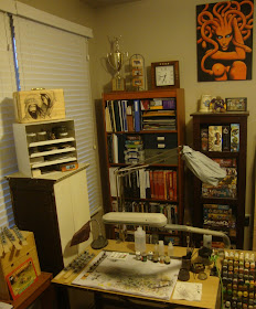
Workspaces gallery 2016

Hi Jungle Painters,

it is about time. 
Via our Happy Birthday Massive Voodoo Celebrations we asked you to show us one photo of your workspace to enter in the happy b-day contest. Three persons will be picked to win a skype session with one of the following gentlemen:


We now bring you all the entries. First calculations said it was 46. Today Roman was downloading all the photos and the organisation behind the curtan and he realized that it is only 44 photos in this folder. The other four were organisation emails concerning this topic. Allright, 44 it is then. Thanks to everyone for participating. We will let you know about the winners in the next two or three weeks.

Please enjoy the gallery:


#01: Allan
"The wooden table and that lamp give this workspace a lot of style. By looking at it, I get the feeling of just being able to sit down and do create. Your workspace feels like an invitation and that is a very good sign!" - Roman

#02: André
"That is a beast. A true beast. The chaos sign fits it very well. This workspace looks like it eats you like a bloodhound. It roars, it looks like a metal drummers place where a chaos barbarian plays the wardrums. A wild one. A wonderful one. I bet you can go wild and free and loud on this one! Boom!" - Roman

#03: Andy
"This looks like a good captains cockpit. Not only because of the stars on the screen. It is well organised and everything is at hand in the moment you need it. Captain ready! Take off!" - Roman

#04: Anja
"A beautiful space to work. The light from the left gives it equisite charm and it looks pretty much in action." - Roman

 #05 : Benjamin
"Two lamp brothers, sworn to protect and give light in every hour. Simple setup, but effective for rare moments  of beautiful painting hours." - Roman

#06: Christoph
"Ilyad Games around this one everywhere. A kids drawing. A color chart and a family photo. This workspace is also used by two persons. I bet its Dad and son. A lovely palace of moments." - Roman

#07: Claus
"That window, that orange fabric hit by light. Looks also like a setup for two. So much light, so much power. Inviting. Paint here. It calls!" - Roman

#08: Conny
"This is where painting happens. Model in center, banana for powers, a well used wet palette and a color circle for the brain. Really cool!" - Roman


#09: David 1
"A special place. It looks so authentic and alive. A small temple to hide from the outer world, to be in your own world. Character. Personality in it. Huge. Organised Chaos. Love the yellow helmet!" - Roman

#10: David 2
"Organised in areas of tasks. Well lid and huge. A painters dream." - Roman

#11: Devon
"Again same here. Awesome setup for managing different aspects of the hobby. Very focused and clean." - Roman

#12: Diana
"This workspace is just so calm and yet so wild. So simple, so effectiv. Beautiful in its simplicity and was one of a kind in the overall gallery. Syle with the white walls and alive with the wood. Feels limited, but endlessly open the same time. Love the window."  - Roman

#13: Dominik
"Windows and light do good things to rooms and people. I have heard so and I see it in this photo too. Again well organised in the different aspects and tasks the hobby can offer. Well done!"- Roman


#14: Donal
"A place to sit and work. Light makes it even more beautiful. Inspiration to the wall and on the book shelves. A good one to sit at!" - Roman

#15: Hajo
"Wrroooomn! This workspace looks like a formula one cockpit. It is focused on absolut effectivness while at work. Like a fast car an empty streets. Wrrooomm! And milk!" - Roman

#16:  Harald
A wonderful solution and a great photo. Not so much space availabe, but the best thing made out of what you got! The photo rocks! Angle. Light. Black and White." - Roman

#17: Jens
"Very well used space. Not so much space, but again very well used and organised. The metal sticker to the right tells what is going on here, but always on the healthy side of things with the air circulation thingy going out of that window. Thumbs up!" - Roman

#18: Jonas
"The most ridicolous and fabolous workspace I have ever seen. Looks like a closet, feels like a closet. Looks like one square metre at all, but also a place where your back gets stronger with a ergonomic chair. A strong back is always good when you are a painter. When looking at this I feel like a little future Manga city was build in a too tiny closet. And everything is busy, but well organised. A skyscraper on its own. Love it!" - Roman
 

#19: Jörg
"The beauty of light. Again a workspace for two. I can feel a lot of laughter and love there!" - Roman

#20: Jürgen
"Precise setup. Precise sharp lines, precise paintwork going on. Love the inspirational magnet board." - Roman


#21: Kat
"Huge! The cockpit of the enterprise!" - Roman
 #22: Koen
"My room, my castle. This is me. This is what I am. This is where I create and follow dreams and visions. Mine. My castle. Nobody tells me what to do or not to do in here. This is me. This is where I am me. And Music." - Roman

#23: Kyle
"With the yellow tint it looks like what I would take to Mars to survive there. Also with the boxes of equipment to the right, ready for take off to Mars. Beam me up, Scotty!" - Roman

#24: Leonard
"A workspace for going absolutely wild and crazy. Again this feels like a place where a drummer uses to study!" - Roman

#25: Luis
"Love how the working space is away from the computer screen. When painting the focus is on painting. I always get lazy for movement when deep in painting concentration and I would not go over there to the screen for hours. Wonderful solution here! More painting, less internet. Or let's call it precious moments." - Roman

 #26: Luke
"Now this is a true aircraft carrier. I just miss the guys with the orange flags waving for signals and directions. Wow, superhuge and organised. Main temple seems to be on the left."- Roman

 #27: Mads
"A place to breathe fresh air definatly." - Roman

#28: Mally
"A closet solution for maximum efficency. This is so cool! Closed. No painting time. Opened. Painting time. Closed. No painting time. Open. Painting time. Closed. Open. Wonderful!"

#29: Marcello
"The brick wall makes this very rustical. Clearly and sharply organised and always ready to be used." - Roman

#30: Martin
"The fox hole of painting. I would dig in that foxhole for a while and would forget the rest of the outside world completly! Really cool!" - Roman


#31: Matthew
"A wonderful organised room. Focus is on the temple of painting joy. Sharply organised and aiming only in one direction that draws you in. The center. The palace. The area to let loose!" - Roman

#32: Metty
"Love the light of the window again, the small cacti and the L-shape of your color rack. It catches the light with its L and corners this area as something special!" - Roman

#33: Michael
"Wohow! This is the most beautiful mess that I have ever seen. No time for organisation, I am in the middle of something. All the time and I like it that way, because its my way!" - Roman

#34: Mike
"Very well organised and personal workspace here. Always focused on the painting and good memories." - Roman

#35: Nick
"Great angle of the photoshot. So different than most of the others. 
Lovely photo! Lovely workspace."- Roman

#36: Sandra

"A palace of paint for two persons. We saw several of these in the gallery, everyone adorable, but this one is so special in its symetrie which is not perfect. It looks special also in terms of people who paint there. They enjoy sitting there, being together and enjoying themselves while everyone is one is own journey through paint and colors and mysterious dreaming into far and further fantasy worlds. I would love to see the window throwing in light to this."  - Roman

#37: Sascha
"The center of it all seems to be the screen which is not bad at all. The painting area yells at me to have a little more attention. Red seems to be a favourite color in here! Red means speed and faster."
- Roman

#38: Scott
"Always ready to sit down and paint. Very workable area over here. Everything at hand and go!"
- Roman

#39: Sebastian
"Clearly focused on one thing: Painting! And most number of MV stickers in one photo. This deserves a special price." - Roman

#40: Sergio
"Such a beautiful - again well organised - working area. Everything setup to do different hobby aspects in different locations and moods." - Roman

#41: Tim
"A small but precious area. I can feel that in every corner, every inch, it breathes character and joy! And MAD MAX, oh man I love these!" - Roman

                                                                          #42: Tobias
"This looks like miniature painting should be presented in a movie for the cinemas. Imagine the hero sitting there with a mysterious aura around him. Painting for relaxations in his bathrobe. Drinking coffee or tea. A call on the red telephone. The hero gets into the batcave, ready to rescue Gotham from its scum." - Roman

#43: Trent
"Everything you need is away only half your arm length. Perfect setup for beautiful painting moments." - Roman

#44: Val
"The last light on the tree shall guide me through the darkness to the right. Only black masses there. Contrast. Lots of. The Last Light. Like this one a lot!" - Roman


_________________________________________________________________________________

Roman will do judging work 
over the next couple of weeks. It could go faster, but you know monkeys are always busy and this is something special that needs time. Roman will judge from his heart with no proper judging rules. Just gets an impression of your workspace and this needs proper time. Stay tuned! 

_______________________________________________________________________________
You want to support Massive Voodoo? 
If you like to support or say thanks the monkeys of Massive Voodoo in what they do, please feel invited to drop a jungle donation in their direction via paypal or check their miniatures they got on sale here.
_______________________________________________________________________________


Keep on happy painting!